By using DTP (Desk top Publishing) and image manipulation software, I have to produce the front page of a ‘new school/college magazine’, featuring a photograph of a student in medium close-up plus, appropriately laid-out text and a masthead.
Here I will demonstrate my initial ideas; broken down into:
- Themes for the magazine
- Layout, Fonts, Colours
- Appropriate Pictures and Titles that will capture the audience.

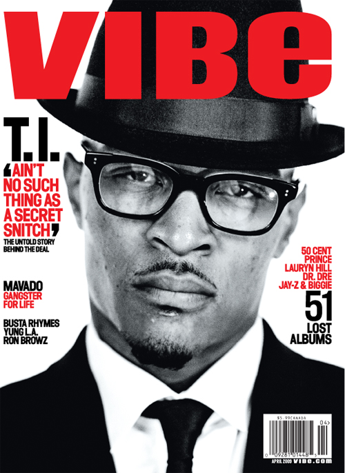
Here are some examples of professionally produced magazines; these magazines have given me an initial idea into the layout of how I would want to present my front cover. What I notice about these covers is that the main image takes up the whole space of the magazine, with the celebrity in a pose that makes eye contact with the reader. This demonstrates the main focus of the magazine, and will draw in an audience, due to the fact that the celebrities are in an inviting pose.
When taking my photographs for my preliminary magazine task, I wanted to take this particular technique into consideration. By taking a medium close up shot of my model, I ensured that she kept eye contact to attract an audience. Along with striking layouts, cover stories and catchy by lines these features employ importance into making the magazine successful overall. I also understand that the name of the magazine influences the reader into the type of material that will be featured in the magazine, so the name that I pick for my front cover will massively affect my intended audience.
I tried to seek inspiration from the SFX college magazine; I particularly thought that the overall layout of the magazine was positioned in a neat and clever way. However I felt that that specific magazine lacked interesting cover stories, so instead I looked on at popular lifestyle magazines to see how I could incorporate some of their technical devices in my own work. One particular magazine that I worked closely with was ‘Look’ magazine as I enjoyed the vibrant use of colours and interesting perceptions into layout and positioning of the pictures.


The front page, is eye catching and attractive and the use of colours relate to the personality of the magazine. The contents page is particularly effective, as its bold and eye-catching. It breaks up the magazine into sub-sections which expresses clarity and categorises each story in its importance.
----------------------------------------------
MUSIC BLOG;
PRE – PRODUCTION, PRODUCTION & POST PRODUCTION
The genre of magazine, that I have been assigned, is ‘House Music’. House Music is a type of music that I am very familiar in as it has had a particular influence in to the types of music I have been able to listen to in my generation.
House is a style of electronic dance music that originated in Chicago, Illinois, USA in the early 1980s. It was initially popularized in mid-1980s discothèques catering to the African-American, Latino American, and Gay communities; first in Chicago, then in Detroit, New York City, New Jersey, Los Angeles and Miami. It then reached Europe before becoming infused in mainstream pop and dance music worldwide since the early to mid-1990s.
House is strongly influenced by elements of soul- and funk-infused varieties of disco. House generally mimics disco's percussion, especially the use of a prominent bass drum on every beat, but may feature a prominent synthesizer bassline, electronic drums, electronic effects, funk and pop samples, and reverb- or delay-enhanced vocals.
House Music can be divided into many various sub genres; such as Electro House, Hip House and Tribal House to name a few. House music is forever evolving in our mainstream society, becoming more recognised in the charts and appreciated for its self expressive ‘vibe’ that many fans love so much.
Here are some of the videos I have looked at for inspiration;
This song marked the new era of the house genre, becoming an influential anthem for the genre as it peaked at number 23 in the charts, symbolising that House Music was becoming increasingly recognised and popular in modern culture.
The Swedish House Mafia is a group formed by three house DJ’s and producers, Axwell, Steve Angello & Sebastian Ingrosso. These three DJ’s have helped make a breakthrough in House Music. They have left a mark in the charts by collaborating with many successful artists such as Pharrell and Tinie Tempah. By incorporating these artists into their work, they have been able to appeal to a mass of audiences, reinforcing that House Music is a genre that can branch out to many fans.
This song happens to be one of my favourites. The Duo rose to fame in the late 1990’s and have played a major role into the evolution of what House Music has grown to become. They have been widely received in many countries, but particularly successful into promoting the scene in London.
----------------------------
For inspiration, I looked at the magazine MixMag, as I found it very hard to find a specialised House Music magazine that only talks about House music. MixMag have publicised various aspects of the House music scene, covering the acid house era to the reign of the subsequent rave era. This is a dance and electronic magazine, however it features house DJ’s, and promotes them as breakthrough artists as they have had the power to branch out in many of music’s genre’s influencing an evolution into being able to adapt to many people’s tastes. I did not find specific ‘house magazine’ covers therefore could not base any designs specifically on that genre. Therefore I understand that magazines aren’t always meant to target one specific genre, they are not meant to exclude any type of audience. I know understand that being able to attract diverse audiences, works to a certain advantage. Magazines main purpose is to appeal to a wide range of audiences persuading them to purchase their content based on ‘preferred reading’ whilst catering to everyone in its target audience.
My media product will challenge the stereotype of House Music magazines. Through my analysis of the genre, I have noticed that many of the DJ’s and artists are of an older age group rounding from 28 – 40+. Therefore my magazine will mark the new era of young DJ’s embracing the genre. 2010 has been a pinnacle year; therefore I choose to produce my magazine as a pinnacle edition issue, embracing a new milestone in the genre. My magazine will utilise the ‘Swedish House Mafia’ as a template for its focus on the magazine. My issue will include interesting cover lines and stories to mark the new era. My front cover picture will take the whole spread, without any other feature pictures.
My magazine represents the youth market, specifically targeted at students and young adults from the ages 18 – 25. My intended audience for my magazine is for those who love House Music and dance music. Mainly aimed at young adults who are like to socialise by going to underground clubs and raves. House music and its sub genres, is popular for those in University, experiencing the ‘Fresher’s’ parties and excessive clubbing and socialising. House music is specially known for its ‘Raving’ nature, and does excite those who are coming out of higher education and looking for ways to entertain themselves. That is why House Music and Dance Music go hand in hand, for their clubbing environments. My media product is very urban, slick, challenges stereotypes as many of the house DJ’s are of age, therefore my artists are fairly young, to appeal to a younger audience. The type of media institution which may distribute my magazine may be institutions such as HMV and vintage record shops, selling rare vinyl records and retro merchandise. I think that other specialist institutions selling diverse range of magazines such as WHSmith’s would sell my magazine as they sell magazines under diverse categories.
------------------------------------
WEEK 10
I am designing my media product to challenge House Music stereotypes. I will be able to accomplish this, as the idea of my magazine is to celebrate the new era of young DJ’s arriving on the scene. One particular magazine cover that I will be using for inspiration is one from Mix Mag.
 By learning the different connotations of colour, I feel that this will enable me to appeal to my target audience a little bit more personally. Therefore I will need to be tactful in the way that I layout my front cover. I have also noticed that depending on the time of month a magazine is issued, reflects the content inside the magazine. For example this issue of MixMag was issued in February. February is one of the coldest months in the season of winter, and this is cleverly represented through the extensive use of blue. Blue is a masculine colour, and the by line ‘The DJ Revolution’ widely ties in with the fact that being a DJ is a fairly male dominated career, which shows that males dominate the House Music genre. ‘Revolution’ is highlighted in orange which shows energy and joy, of a new era. Through utilising different colours, I want to be able to connote to my audience the kind of detail I want to advertise in my magazine. I want my audience to be able to identify with my magazine and through semiotics be able read in between the lines of the content within my magazine.
 ---------------------------------------------
WEEK 11
I feel that my magazine cover challenges other magazines in its genre, as it is representing the younger demographic audience of that particular genre as well as its typical intended audience. By giving my magazine a theme, I feel that it helps add personality to the magazine itself, and helps the audience to familiarise itself with its content.
I have learnt that the quality of the pictures, produce a whole lot of emphasis onto the quality of the magazine. Through analysing other magazines for inspiration I have understood that layout plays a major role into capturing an audience. If the layout is creative and colourful, the audience will be more attracted and willing to read on to see the rest of the content included in the magazine. The quality of the camera, combined with the more time spent editing the pictures, really aids the appeal for the audience. It keeps them interested, ensuring that they are willing to purchase the product. However through further research I would like to have used semiotics to intrigue my readers, by thinking outside the box.
Looking back at my preliminary task, I feel that my time keeping has let me down once again for the overall completion of the work. However, I have thought more about the shots of my pictures and the layout of my magazine. I have worked closely with templates and ensured that I give my magazine a professional look.
___________________________________________________________________
WEEK 14


Through completing my front cover and gaining feedback I understood that my main image did not fulfil its main purpose in attracting its intended audience. Therefore I have decided to change the front image and change the theme of the conventions I am trying to challenge in the form of real media products. By doing this I need to ensure that the idea that I am trying to convey in my front cover, is reflected through my contents page. The new concept of my House magazine is the new influence female singers have on the genre. House is a mainly male influenced genre, with all DJ’s and Artists being predominately male, however the sudden influx of female liberation has meant that female DJ’s and artists are embracing the scene.
Contents page related I am still using ‘MixMag’ magazine as my inspiration, as I feel that they incorporate the conventions required of the ‘House’ genre. Here is the picture of the contents page that I am trying to replicate:

The colour used on this page is simplistic, and does not draw attention away from the main images of the contents page. Based on a white background, the use of black and yellow helps the main headings to project the content of the picture, without distracting its main focus.
The layout of the contents page is categorised into sections of interest and importance followed by minimal captions to keep the audience immersed in the issue.
Current and contemporary images are listed on the right hand side of the page, numbered in importance, followed by pictures. The pictures all relate to a particular topic mentioned on the front cover page.
There is a bold black and yellow line to separate the page accordingly. The free gift featured in the magazine, has a paragraph, discussing the content within the free gift and why this month’s issue is unlike any other.
The two main images on the contents page, enables the reader to gain a feel for the sort of topics that will be discussed within the issue. The biggest picture on the right hand side is part of a ‘real topic’ feature that discusses hard hitting topics, such as ‘Partying abroad, Drugs, Sex & Alcohol’. This shows that although a music magazine, MixMag attempts to connect with its audience on a much deeper level, and through my work I want to be able to relate the same sort of impression on my readers.
I am designing my media product to incorporate all the themes that I have just mentioned. As far as social groups, I am demographically targeting my magazine to a youth market as my content will have more appeal to this age audience. My contents page will list pages in order of importance, as a sort of taster as to what to expect in the magazine. I felt that this was very clever technique in MixMag magazine and I would like to incorporate into my own design. From a youth market perspective, I have analysed that the simplest layouts and colour themes work best, they articulate the main selling points of the magazine without bombarding the audience with too much to look at and interpret. The fact that Female House DJ’s are the main focus point of my magazine will enable the females of my target audience to be represented in the genre, as I feel that women are not represented well in House Music. My free gift included in my magazine will attract my audience, as I have enabled it to be an exclusive feature only available to my readers. I have decided to change the method of paying for my magazine and make it part of a subscription this will increase the level of exclusivity of my magazine.
________________________________________
Week 15
My media product fulfils its purpose in using the forms and conventions of real media products, through its layout and fonts. My media product utilised MixMag magazine extensively, in order to replicate the same conventions that it promotes in its own magazine. However my magazine challenges the way females are represented in the House Music genre. Through analysing the genre, it has become apparent that female DJ’s and artists are now becoming more recognised; therefore I wanted to incorporate that into my own work. I felt that when a women was being represented in the House Genre, they were only represented in a sexualised way, not for their efforts, therefore I wanted to challenge that and present females in a positive light. I feel that my product has been successful in the way it appeals to its audience; it has carefully replicated the same effects that are presented in MixMag.

MixMag Magazine

My Magazine
I have learnt that in terms of technology, to really excel in the process of constructing processes like these is to really spend time editing pictures and concentrating on effective layouts. One of my aims was to really spend time and explore new techniques of editing my pictures, and I felt that I have come a long way from the start of the year, where I was absolutely clueless about Photoshop and InDesign. I have also learnt that the quality of camera can make a big difference to the quality of the camera shots and layout of magazines. If the camera is not of good quality and the lighting and shots are poor it will not benefit the appeal of the magazine, nor will it promote the message that the magazine emits.
Looking back at my preliminary task I have now seen that I have progressed in terms of layout and composition. My contents page is clearly presented and fulfils the purpose it is trying to promote. I am now more willing to explore out of my comfort zone and take shots which depict story and personality. My editing has also improved and I pride myself on the time spent on editing my pictures. However if there is one thing that I would change about the whole experience, is my time keeping and planning. Planning ensures that through thorough and extensive hardwork and attention to detail, the end product gets the professional finish and detail that it deserves.