Media Evaluation - Annie Gnoan
-----------
Seven Questions
Evaluation of Media Project In Relation To Weeks 23, 24 & 25
In what ways does your media product use, develop or challenge forms and conventions of real media products?
The genre of my music magazine was largely based on the ‘House’ genre, an era of music that arose in the 1980’s originating in America, Chicago - Detroit. House music is a type of electronic dance music, which throughout the years, has made its mark on popular mainstream culture. Largely inspired by Disco music, which incorporated and blended; Soul, R&B, Funk, heavily adorned with celebratory messages about love, sexuality, emotions and dancing, House expanded on the same themes, whilst incorporating electronic synthesizers, electronic basslines’ and drum machines. Broken down into many subgenres, House is a genre that is very popular among the club scene culture. The Club scene culture, is mainly associated around Nightclubs and Party Islands, mainly popular among adults aged 17-29+ during their higher education years.
Whilst sketching out the plans for initial ideas for my magazines, as House is a broad genre, I researched further into its subgenres and the areas in the world that they are most popular in.
-
 United Kingdom
Funky House, Hip-House, Electro House ,(Dubstep)
- United States Of America
Acid House, Garage House, Disco House
- Eurodance, P-Funk, Hi-NRG
I then narrowed down the sub-genres into the regions that I was most familiar with, and then did further research into the types of material they promote and the artists that have influenced the music. My focused area that I will be basing my magazine on is the United Kingdom. During my adolescence I have grown up in the era of Funky House, HipHouse and Electro House, therefore I felt that I could add an insight into how these sub-genres have influenced my generation. I could not pick just one of the UK sub-genres to feature, therefore I felt that I should incorporate them all, in order to interest all types of audiences, as many of the artists, DJ’s and songs have really dominated mainstream culture. Here I have selected a few music videos from the elements of House that I will be incorporating in my magazine. These songs and artists have hugely influenced the dynamics of the genre; from 2005 to the present there has been a sudden influx into the popularity into these areas of music.
Funky House Dennis Ferrer; Hey Hey. This video is a promotional video of the Single Hey, Hey, available on ITunes. Dennis Ferrer has been an influential DJ in the evolution of House, and has really been a credit to the genre. - Fish Go Deep; Cure & The Cause This video was released in 2005 and saw the popularity of Funky House rise. - Crazy Cousinz Ft. Kyla; Do You Mind? An influential video as it symbolised the airing of Funky House songs on music channels such as MTV and Kiss. | Electro House Jennifer Lopez; On The Floor A great example of the genre becoming increasingly popular, the song has been taking radio by storm and is soon to become a world smash hit, The song samples the Lambada beat, but adds it'slatinflavor to it making it a electro house hit. Bodyrox Ft. Luciana; Yeah Yeah This track is considered to have defined both the genre itself, and the name for the genre, for the first time in 2006. Kid Cudi; Day & Night (Crookers Remix) | Hip-House (UK Garage, Closely Related To Dubstep) Technotronic; Pump Up The Jam Dates back to the earlier influences of House and how it has evolved throughout the years. Delinquants; My Destiny The end of 2007 saw "new skool" UK garage push to the mainstream again with notable tracks like Delinqent's "My Destiny". Artful Dodger Ft. Craig David; Rewind Released in the UK December 1999 and reaching No.2, it was David's first chart success and is also considered by many to be the point when the Garage genre had crossed into the mainstream. |
I have been closely following MixMag Magazine, in relation to completing my magazine, reading the content included, features and articles from Artists and DJ’s. This electronic dance and clubbing magazine fuses all three genres, along with Dubstep to provide the entire latest goings on in the ‘raving scene’.
The History Of The Magazine
 The first issue was printed on February 1, 1983 as a 16-page black and white magazine published by Disco Mix Club — the DJ mailout service. The first cover was Shalamar, the first editor DMC’s Tony Prince and the first advertiser was a company called Technics Panasonic. When house music began, editor and DJ Dave Seaman turned the magazine from a newsletter for DJs to a magazine covering all dance music and club culture. Mixmag covered acid house, the subsequent rave era, the rise of superstar DJs and Ibiza. The magazine claims to have coined the terms superclub and trip hop and to have launched the first legal DJ mix tapes, the Mixmag Live series. Later Mixmag, in association with their original publishing company, DMC Publishing, released a series of CDs under the "Mixmag Live" heading.
Mixmag was sold to EMAP Ltd. in the mid-1990s before being bought by Development Hell, the company that also owns The Word music magazine, in 2005. Development Hell re-launched Mixmag in May 2006 with a revamped design. Editor Andrew Harrison told the Press Gazette that staff had previously "focused the magazine very tightly on a young clubber, a very committed hard-core‘nutter’, clubber and we thought that wasn't necessarily the right way to go. Mixmag is now a magazine for the entire world of dance music, whether you like hard boshing music that's quite druggy, or chill out music, or you're someone like me who likes to keep in touch with the music but has grown out of clubbing. This idea that dance music is a kind of minority interest, a bit like ska, is wrong." [Source; Wikipedia]
Another magazine that I have also been following and using for inspiration is RWD as they also feature elements of House Music, (Funky House and Hip-House) into their magazine, making it popular amongst teenagers and young adults in the UK.
The History Of The Magazine

RWD Magazine (also known as Rewind or RWDmag) is a British based magazine which features news, interviews and charts on hip hop, RnB, UK garage, Drum and bass and US house music. It is released monthly, distributing 36,040 copies each time and is ABC certified. It considers itself the largest magazine on urban music and lifestyle in the United Kingdom.
As well as the magazine, RWD Mag has a website which features music videos, tracks and artist profiles.RWD Magazine provided a platform for emerging unsigned artists to get their names and their faces into every popular underground music outlet. This works by aspiring artists paying to feature within the magazine. This may not seem very desirable at first, but the magazine's healthy distribution and circulation makes this more attractive. The magazine enjoys a relatively healthy distribution and circulation as readers can pick up the magazine for free. [Source; Wikipedia]
In terms of my music magazine, I will largely be basing it around the area of Funky House &Electro pop, as I believe that these subgenres are so relevant in the culture of 2011 and the most relatable and transferable into the type of magazine I want to produce. I will be developing the genre of my magazine with a female perspective, and be largely basing my issue on Female House Artists. My reason for this, is that through extensive monitoring, I have noticed that the House Genre is mainly male dominated, therefore I thought my target audience could benefit from viewing the genre from a female perspective. I have gone into the archives of both magazines and analysed the semiotics and layouts of particular issues that I thought were very influential and challenged the genre.


Both magazines incorporate bright headings and colours to attract their audiences however challenge the audience to look at both issues in different ways.The RWD Issue, features House DJ and vocalist, Yazmin, an upcoming artist who is really making her mark in the genre. She uses her sex appeal and beauty to entice the audience, and seduce the reader into reading the issue. This coincides with Laura Mulvey’s ‘Male Gaze’ theory, that women are only there to be looked at, promoting this notion of "to-be-looked-at-ness." I feel that this method is very effective into attracting audiences, both male and female, as men will be enticed, whereas females may want to aspire to be like her. The MixMag magazine issue promotes female DJ’s such as Annie Mac and celebrates the breakthrough that DJ’s like her have started. She is a pioneer for a new wave of females trying to break into the genre and this issue praises their efforts. In respect to my cover I want to elaborate on the RWD issue, and focus my magazine around the Male Gaze, and utilise femininity as a tool to capture my audiences.
My contents page is using form and conventions of real media products in order to successfully attract its intended audience. I believe that the main job of a contents page is to inform the readers in a clear precise way of what to expect in a magazine without giving too much away.

Contents page related I am still using ‘MixMag’ magazine as my inspiration, as I feel that they incorporate the conventions required of the ‘House’ genre. Here is the picture of the contents page that I am trying to reinact: The colour used on this page is plain but effective, and does not draw attention away from the main images of the contents page. Based on a white background, the use of black and yellow helps the main headings to project the content of the picture, without distracting its main focus. The layout of the contents page is categorised into sections of interest and importance followed by minimal captions to keep the audience immersed in the issue. Images are listed on the right hand side of the page, numbered in importance, followed by pictures. The pictures all relate to a particular topic mentioned on the front cover page. The two main images on the contents page, enables the reader to gain a feel for the sort of topics that will be discussed within the issue. The biggest picture on the right hand side is part of a ‘real topic’ feature that discusses hard hitting topics, such as ‘Partying abroad, Drugs, Sex& Alcohol’. This shows that although a music magazine, MixMag attempts to connect with its audience on a much deeper level, and through my work I want to be able to relate the same sort of impression on my readers.I want to be able to do that with my magazine and be able to really sell the cover-lines and stories in order to entice them. I feel that my contents page is still in need of work, in order to really sell itself to its audience. It was hard to get images of contents pages that I could replicate, and felt that the MixMag magazine contents page really was the only example that was flowing in the simplistic direction I wanted my magazine to go in.
I feel that simplicity is key, as House is a very manic genre with a lot going on, and therefore want to tone down the overall look of the contents page to reflect a mellower, sombre effect of the genre.

I am replicating this double page spread in order to use for my design of my double page spread. The reason why I believe that this double page spread works in relation to my magazine is because it promotes the ideology that women use their femininity to sell the music. A quality that House, utilises at its disposal in relation to their female artists. The double page spread is not too provocative, as such covers like Vibe, XXL etc., however it stimulates, sex appeal in a clear simple way. I hope in order to fulfil the same outlines mentioned in order to produce a successful double page spread.
How does your media product represent
particular social groups?
The age of my magazine will not be discriminatory; however it will be mainly targeted at an age group starting from the ages 16-35+, the ‘Youth Market’. Therefore I want to appeal to that demographic audience, and will feature topics that largely reflect their musical interests. House music is largely associated with the ‘Clubbing’ culture, therefore attracts an audience who may tend to socialise in nightclubs and raves. The reason why I have chosen to base my audience upon that of the Youth Market is because they are the audiences who are most likely to conform and aspire to the themes, topics and issues related in my magazine to fit into mainstream culture. The majority ages of the artists, models and icons in the magazines are young adults, therefore might not appeal to the elderly. There are uses of attractive models, artists and icons in the magazines, to further promote the ideology of westernised beauty and youthfulness. Whilst researching House, I felt that the ideologies sort of took their own approach into the way that they represented themselves. The artists and models featured on the covers were from a range of ages, ethnicities and class backgrounds, which helped summarise and clarify that genre was not discriminatory or only made for one selective group of audience.


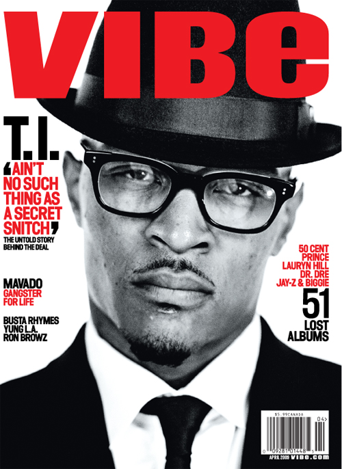
Some of the representations that House music generally portrays are similar to that of the R&B genre, however not as derogatory and demeaning. Both editions of the magazine both use provocative poses to entice and grab their intended audiences. Both models use their femininity to their disposal. The ethnicity of Vibe magazine is mainly targeted at an Afro-Caribbean background, however many of the artists are popular in mainstream culture, attracting a wider audience than that of House. The ideological content that is promoted through MixMag is that females are only utilised to be looked at and adored. The overt sexually positioned pose is similar to that of ‘Vibe’ magazine, it draws the audience in. The representation that is presented in these magazines is the idea that ‘sex sells’.

However when a male artist or model is featured on the cover, the magazine’s approach to attracting its audience is different. Both magazines use close up pictures of their models on their covers. However through selective colour choice and layout they both transmit the mood of the magazine, the themes and content that might be featured in the issue. The models do not transmit any use of sex appeal to their disposal.
This reinforces John Berger theory; “Men act and women appear. Men look at women. Women watch themselves being looked at”. I want to include these representations into my own magazine, promoting femininity and sex appeal into making my product. I will be trying to incorporate all the themes that Vibe, RWD and Mix Mag magazine use in their products in order to appeal to my chosen audience.
My media products reflects the Youth Market because they are the audiences who are most likely to conform and aspire to the themes, topics and issues related in my magazine to fit into mainstream culture. Men look at women. Women watch themselves being looked at’ theory. The age of my magazine is targeted at a Youth Market which means that the content reflected in my contents page has to be eye catching and designed in such a way that is suited to their overall taste. I have incorporated interesting cover-lines and titles in order to reflect the current views that are affecting my chosen target audience in this point in time. This enables the magazine to be contemporary and fresh, and reflect some reality into the types of topics within the genre. The social class that I am representing is of D and E social demographics. They are more inclined to purchase my magazine as the topics within it reflect the type of lifestyle in which they are currently living in. The ideological content that my magazine contents page is trying to portray is of the ‘Partying lifestyle’ as this is the type of audience that I am trying to draw in and attract. My contents page reflects that and hopes to engage its reader of a deeper meaningful level. The double page spread, aims to portray a positive female house artist in such a way that challenges and goes against the norms and conventions of what the genre conceptualises; which is the fact that this genre is male dominated.
What kind of media institution might
distribute your media product and why?
Music magazines are generally sold in newsagents, and stores that promote the distribution of music such as supermarkets like Tesco, Morrisons, Asda& Sainsbury’s to name a few. However they only sell popular mainstream magazines such as Q! And Kerrang magazine, in vast quantities due to the fact that they have a mass target audience. Specialist stores like WHSmith and music stores such as HMV may distribute music magazines related to specific genres of music. Vintage record stores/shops, may distribute House music magazines due to the niche that the genre is targeted at.
To find out how Music magazines are displayed, i went into the specialist store WHSmith, and my local newsagents to find out how they are presented in terms of; genre, colour and layout and quantity. I found that in WHSmith they sold more lifestyle magazines than they did music magazine, which shows that the demand for Music magazine is not as high. Music magazines were found in the category, ‘Entertainment’ and then in the sub-category, ‘Music & Audio’. The magazines were not then further arranged in terms of specific genre categories, and found that they was a greater number of niche magazines than mass magazines. What I mean by this is that magazines such as ‘BBC Music Magazine’ and ‘Opera Now’ had a larger supply of music magazines in relation to ‘Q!’ and ‘Uncut’. For this reason I came up with the interpretation that, stores supply a lot more niche magazines than mass magazines in order to make sure that that specific audience is well catered for. In terms of colour and layout, the organisation into the way the magazines were arranged was not eye-catching or appealing, however the mass magazines were more noticeable due to their bold colour arrangements, masthead and pictures.
Whilst at my local WHSmith store, I asked one of the team members if they had any copies of RWD or MixMag magazine. The team leader informed me, that RWD is not sold at their store, although MixMag is. They later added that however, at that point in time MixMag magazine was currently out of stock. They also later informed me, that if I wanted to purchase that specific magazine I was better off browsing online at their specialist magazine website; http://whsmithmagazines.co.uk/.

I visited the website and saw that it specialised in magazine subscriptions. A magazine subscription is where, the magazine is sold to readers for a price, by subscription, where an annual fee is paid and issues are sent by post to readers. A magazine subscription allows flexibility and is practical due to being directly delivered to the domain of the reader, which ensures that they never have to wait an excessive amount of time for their magazine issues. It also allows them to purchase their magazines at a discounted price, which ensures that their magazines are affordable. There is exclusivity in magazine subscriptions, and readers are inclined to receive special offers which may not be included to other customers, such as special posters, calendars, CD offers etc.
MixMag magazine’s personal website allows their readers to subscribe directly to them. Whereas the distribution of RWD is free. RWD is a free magazine available in Specialised Sports Stores such as JD Sports and Bench. This means that there is no cover price and issues are given away, for example in street dispensers, airline in-flight magazines or included with other products or publications.
It enables readers to sign up directly via their Newsletter with their email addressesand provides them with a link in order to be put on the mailing list. This way their readers can have access to their magazine, whilst on the go. For example, I myself have joined RWD and can access the magazine via my BlackBerry which is practical and viable and ensures that I will always have a soft copy of the magazine with me. This is very beneficial, as it shows the positive effects of moving from Hard media to Soft Media. At my local newsagents, I encountered similar problems, and found that RWD and MixMag were not distributed in my local area. However there was a wider variety of music magazines on offer, such as Vibe and Rolling Stone. I asked the clerk whether he would consider ordering magazines such as MixMag and RWD and says he has never encountered a demand for these types of magazines. Whilstconducting my research, I looked into Magazine Publishers that produce music magazines. I found that, there aren’t many publishing corporations that solely cater and specify just in music magazine distribution.
I researched into IPC Media and Bauer Media, two publishing corporations that specialise in magazine publication. IPC Media is the UK's leading consumer magazine publisher with approximately 90 brands and selling 350 million magazines every year. I found that IPC Media specialise really well in Lifestyle magazines, and found that the only music magazines that they distribute were NME Magazine and Uncut Magazine. Bauer Media on the other hand, distribute Mojo Magazine, Q Magazine, Kerrang Magazine, and specialise in Radio Broadcasting. They broadcast popular local radio stations in the UK such as Magic FM, Kiss 100, &Kerrang. They own major music television channels such as the Box, 4Music & Kiss 100. This shows that Bauer Media have insightful knowledge in the way that music distributed products are presented. Therefore I would choose Bauer Media to distribute my product. They have the means to distribute and advertise my magazine to its targeted audience whilst attracting other audiences via their radio stations or via television stations, to enable its readers to gain access to the product on a larger platform.
I have been researching extensively into the different ways I can distribute my product to its intended audience and have found that utilising the internet in terms of distribution is most effective. The reason for this is that it enables the audience the chance to have access to the magazine, whilst on the go. It minimises practical issues and enables flexibility into the way the content can be viewed and accessed. Distributing magazines online as well as in stores such as supermarkets, specialist stores and specialist music stores enables your product to have credibility and appeal to its audience as they have preferential choice in how to obtain the magazine.
Distributing the music magazine online, is cost effective for the magazine company, it costs the magazine less in printing and advertising, whilst giving them the chance to advertise more freely as it is the internet. There are additional videos and links that the website of the magazine can share with its audience if it remains online, which means that the reader has more value for money and is entertained with the features of the magazine. Readers can subscribe to the magazine instantly if they wish to view the magazine as a hard copy each month, as they may have the chance to subscribe directly, which makes the magazine more personal for them.
Again in terms of distributing my magazine as a ‘Hard’ copy, I would still use Bauer Media as its publishing company as I believe they have the most experience in dealing with music related products. They own a 50% stake in Box Television, a range of music channels as well as its specialised music magazines and radio broadcasters.
This video shows the different ways Bauer Media has impacted the media industry with its product, and has enabled me with the chance to understand that they have the knowledge and experience to deal with my product, as my product is very similar in regards to the products that they have produced.
Who would be the audience for your media
product?
The audience for my media product is targeted mainly at a niche; however House is a transferable genre that attracts a variety of audiences who are interested in genres such as R&B, Pop and Hip-Hop etc. the audience for my media product has altered and changed throughout the months of conducting my magazine cover, contents and double page spread. The front cover of my magazine will have my fictional female artist, and the topic of my magazine will be based on Funky House.
In my media class, I asked a range of people what they thought the initial target audience of House were. The majority of my class answered that it is targeted at a wide audience of both genders aged 16-30+. Therefore I have manipulated the cover-lines of my magazine to be catchy and bold in order to captivate the young intended audience. I do not want to challenge the idea of the male gaze; instead I want to reinforce it, as it is what gives magazines the ability to sell. I have chosen the colours of my magazine to be simplistic, sophisticated and sleek. These ideas will prove more effective within this chosen audience as they are not as a opposable to it, as found with older audiences who do not care for what the magazine is trying to promote. The magazine promotes youth, and aims to provide a youthful insight into what is happening in issues that appeal to them.
I feel that my magazine cover challenges other magazines in its genre, as it is representing the younger demographic audience of that particular genre as well as its typical intended audience. By giving my magazine a theme, I feel that it helps add personality to the magazine itself, and helps the audience to familiarise itself with its content. The theme of my magazine is “Funky’s Finest Feline’. Themes like this attract an audience of the targeted age I want to reflect in my magazine, it keeps it fresh and current. As mentioned before, my audience is the youth market, and therefore I want the overall look of the magazine to reflect the aspirations and interests of my specific genre.
House music and its sub genres, is popular for those in University, experiencing the “Fresher’s” party lifestyle. The audience that I want to attract indulge in excessive clubbing and socialising. House music is specially known for its ‘Raving’ nature, and does excite those who are coming out of higher education who are always looking for ways to entertain themselves. That is why House Music and my ‘Youth Market’ audience go hand in hand for their clubbing environments. My media product is very urban, slick, challenges stereotypes as many of the house DJ’s are of age, therefore my artist is fairly young, to appeal to a younger audience. One thing I wanted to do was challenge the fact that female artists do not always have the opportunity to grace the cover of male dominated genres, therefore I wanted to explore into the opportunity of making a House related magazine from a female perspective. I have utilised a female on my front cover, in order to give my product sex appeal in order to sell. I also wanted to promote feminism and that is why I have chosen not to go in the same direction as R&B magazine that use derogatory poses, that may offend some of their female reasons. Instead I have used a female as a model for my front cover, so that I can generate a viewpoint in which females can relate to and aspire to be like rather than oppose and disregard. I want my audience to have fair representation and I aim to attract a fair amount of readers, who do not feel excluded or left out within my magazine.
The audience for my media product is targeted mainly at a niche; however House is a transferable genre that attracts a variety of audiences who are interested in genres such as R&B, Pop and Hip-Hop etc. The audience for my media product has altered and changed throughout the months of conducting my magazine cover, contents and double page spread. The contents page is set to inform and inspire the reader of what to expect within this month’s copy of ‘OffBeat’ magazine. The audience for the contents page is still the same as what I have intended it to be for the front cover, and what I hope to deliver in for the double page spread. My intended audience for this magazine as mentioned before is of young adult statuses, who hope to aspire and conform into mainstream society. The target audience is addressed in my contents page as it includes themes that aims to make them feel included and entertained. Again I have used a female, as a model artist in my magazine in order to promote sex appeal.

This is an example of the type of audience I am intending to attract and appeal to. Her name is Megan Sullivan, and she represents the social demographic code of D and E social classes. She is currently a student and aims to succeed during her A Levels in order to qualify for a university place. She is the type of person who is of partying and socialising nature. Her responsibilities are based in education therefore that means that she has more money to spend on herself in the short term, on things such as magazines, music products, clothes and other material items. She has a part time job at a Bakery’s which means she is dependent on herself for income and can spend it however she wishes. When asked about what she would expect to include in a House Music magazine, she explained that she wants to see material that reflects her social group. She suggested, “House music is a genre that promotes a sense of being able to be carefree and creates the image of living for the moment. As someone who really enjoys the products of this genre, include youthful fun images as well as bright colours to attract a wide youthful audience”.

Another example: Jodie Jarret-Thorpe is also a student who is studying for her A Levels, and is also liable to go out partying and socialising in various night club events and festivals. Being a student, it means she has free time on her hands, as well as extra money to spend on herself. When asked about whether she felt her gender was reflected well in my magazine she explained that; “I am in no way offended by the portrayal of young women within OffBeat Magazine. The magazine is youthful and does represent a fair image of females in today’s society.”
How did you attract/address your audience?

I changed the name of the magazine to OffBeat, in order for it to relate to the intended audience. I have come a long way in relation to modifying my front cover page. Feedback from my peers and teacher alerted me to the fact that my previous front cover page did not fit the forms and conventions that my genre was trying to challenge. Therefore I changed the direction that I wanted my magazine to flow in. I decided to go further wit h the idea of feminism and put a female on the front of my cover page in order to reinforce Laura Mulvey’s theory of the ‘Male Gaze’. Women are used as the centre image of magazines in order to entice male audiences, in order for the magazine to have appeal. As discussed in my theory classes, we observed that women generally aren't as opposed to overt ‘sexualised’ poses. This reinforces John Berger theory; “Men act and women appear. Men look at women. Women watch themselves being looked at”. However I did not want to put a sexualised image on my front cover, just in case it caused offence. I have used bright bold colours in order to excite the audience into being attracted to the overall appearance of the magazine, and feel that the colour choice has impacted well on its appeal. I believe that image of the model goes beyond the conventions of the genre as she is an artist who like to travel outside of her comfort zone. Therefore I have tried to incorporate her own style and nature through the composition of the pose and editing.

One of the main modifications that I have addressed within my Contents page is the order of the pages. The pages now run in a chronological order, which means that it is now clearer for the reader to access the pages of their interest. I also ensured that the layout of the contents page was tidy and easy to view. I haven’t listed every feature within the magazine; this is due to the fact that I would like to keep my magazine spontaneous and intriguing. I’d like to captivate my audiences attention, therefore have provided them with a short extract of what to expect under every caption, so that they get a sneak peek of what to expect within the issue. The reason why I have chosen to only use three photographs instead of four, was in order to keep the contents page simple and neat. I felt that in terms of the layout I wanted to produce, three was easier to manage and did not distract the audience's attention in terms of colour and text.

What have you learnt about technologies
from the process of constructing this
product?
I have become more familiar with InDesign and PhotoShop in order to complete my Front cover page. I have been able to manipulate the software in order for the overall appearance to look more attractive for its audience. My first front cover, did not serve is purpose in attracting the audience it was meant to attract, I felt that the theme that I initially had in mind, was not suited to the overall result that I wanted to produce in my final draft of my magazine.
To be quite honest, at first I did not know what form of direction I wanted to take my magazine into. I really did not enjoy the editing part of whole project, the manipulation of photos and mastheads in order to engage the audience. It tested my patience a lot of the time and if I could change anything about this particular product it would be to make sure that I’d have spent an excessive amount of time planning the overall sketch of what I would want my magazine to look like. The process of constructing this product requires a lot of attention to detail and constant feedback, something that I was never really good at understanding. The software that was on the computer was very frustrating and as I was new to the programs at the start of the year, I do see a major improvement in the way I have constructed my pages. I think that my redrafted front cover does engage the audience a lot more, the colour and the layout of the magazine is a lot more pleasing to the eye. InDesign has allowed my cover to look more professional, and appealing.
Looking back at your preliminary task, what do you feel
you have learnt in the progression from it to the full
product?
I feel that my work has progressed substantially, and I feel that somehow I have been able to fulfil what I have set out to do regarding the genre I was specified. I have achieved a great deal since the completion of my preliminary task. I learnt how various photographic poses can entice and intrigue an audience. The challenges that still lie unexplored, is the degree into how much power and credibility female artists could have in this specific genre. I feel that House should be a genre that should have a variety of magazines and other products on offer. As I have researched further and further into this specific genre, I have learnt just how much the music has developed and grown, and therefore feel a little disappointed that it has not attracted a mass mainstream audience.
My work has improved, maybe not a great deal, although despite this, I do feel that I have gained a great deal of knowledge and experience whilst conducting this project. My preliminary task lacked focus of what it was trying to achieve, I believe it did not engage the intended audience and the photography was not successful. Presently I feel that my redrafted magazine has improved a vast amount, the cover lines are relatable and the overall purpose that the magazine is trying to promote is achieved. One major stepping stone that I feel I have overcome has been the layout of my magazine and the composition of colours that have been utilised. It was one area of the task that really proved difficult for me, and I believe that simplistic complementing colours are way more attractive for the audience and do not distract them from the information of the magazine.
Another element that I wish I incorporated into my magazine is the influence, Social Networking Sites have on the music genre, and how there impression has a lasting effect on its readers and viewers. Social Networking Sites, are a wonderful example of how the 'Digital Evolution' has impacted society and the way we view things as an audience. Through looking back at my research, I realise how much interactivity sites like 'Twitter' and 'Facebook' benefit readers, as in some cases it allows their views and opinions on certain issues to be heard. It also helps in terms of distribution, and added extra information that provides them with a sense of exclusivity.
By extensively reading different types of magazines, whilst conducting initial ideas and research, I feel that I have enabled myself to figure out what compositions work and which don’t. I feel that I really have improved in areas of semiotic analysis, and expanded my knowledge on overt and covert connotations and denotations. In relation to technologies, I do feel that more practice would have been more beneficial and worthwhile, whilst completing my tasks. I really did not enjoy the technological process, but completely understand that, that specific process is vital to the overall appearance of the magazine. I have been able to refine my skills in areas of photography, but would have really enjoyed more time to really explore into more detail into utilising different varieties of camera shots. I believe that in doing this, the use of semiotics would have benefited exceedingly. My issues concerning the editing technology are improving bit by bit; I feel that my product is engaging more and more the kind of audience that I want to reflect within my product. I have widened my knowledge of the tools within the programs of Adobe Photoshop and InDesign, and I am now more confident in using different tools in order to achieve different compositions and effects within my work. I have become more confident in using tools such as the ‘polygonal lasso tool’, which enables me to take a focus of a picture away from the background in order to change the mise-en-scene with the image. It shows that I have come a long way from that of the preliminary task and aim to continue to improve throughout the duration of the course.
My understanding of what a media product is has now widened. Planning in the pre-production stages is vital in relation to a successful completed product. Constant feedback from outsiders who view your work is important as it helps you to stay on track in the direction you want your product to go in. It is really insightful and helpful and enables you the chance to reflect your intended audiences, and helps you to work on how to find new ways of pulling in new audiences.
Presentation Slides
Please find below my Presentation Slides 1 - 32, that depicts the overall journey of my media project. It highlights the successes and the failures of the project, and really enabled me to gain feedback from my peers on where to improve.


------------
Preliminary Task
Pre-Production, Production, Post-Production
Weeks 5, 6 & 7
By using DTP (Desk top Publishing) and image manipulation software, I have to produce the front page of a ‘new school/college magazine’, featuring a photograph of a student in medium close-up plus, appropriately laid-out text and a masthead.
Here I will demonstrate my initial ideas; broken down into:
- Themes for the magazine
- Layout, Fonts, Colours
- Appropriate Pictures and Titles that will capture the audience.

Here are some examples of professionally produced magazines; these magazines have given me an initial idea into the layout of how I would want to present my front cover. What I notice about these covers is that the main image takes up the whole space of the magazine, with the celebrity in a pose that makes eye contact with the reader. This demonstrates the main focus of the magazine, and will draw in an audience, due to the fact that the celebrities are in an inviting pose.
When taking my photographs for my preliminary magazine task, I wanted to take this particular technique into consideration. By taking a medium close up shot of my model, I ensured that she kept eye contact to attract an audience. Along with striking layouts, cover stories and catchy by lines these features employ importance into making the magazine successful overall. I also understand that the name of the magazine influences the reader into the type of material that will be featured in the magazine, so the name that I pick for my front cover will massively affect my intended audience.
I tried to seek inspiration from the SFX college magazine; I particularly thought that the overall layout of the magazine was positioned in a neat and clever way. However I felt that that specific magazine lacked interesting cover stories, so instead I looked on at popular lifestyle magazines to see how I could incorporate some of their technical devices in my own work. One particular magazine that I worked closely with was ‘Look’ magazine as I enjoyed the vibrant use of colours and interesting perceptions into layout and positioning of the pictures.


The front page, is eye catching and attractive and the use of colours relate to the personality of the magazine. The contents page is particularly effective, as its bold and eye-catching. It breaks up the magazine into sub-sections which expresses clarity and categorises each story in its importance.


Next time, I will try to include interesting cover stories to attract a wider audience. I will try to use Photoshop more to make my pictures more captivating, and think of attractive layout concepts.
I will use both InDesign and Photoshop, to help give my magazine a professional look. I will use more magazines for more inspiration, and try and merge them into my own creations.
And next time I will ask for more feedback to make sure that my audience is well represented.
----------------------------------------------
MUSIC BLOG;
PRE – PRODUCTION, PRODUCTION & POST PRODUCTION
Weeks 9, 10 & 11
The genre of magazine, that I have been assigned, is ‘House Music’. House Music is a type of music that I am very familiar in as it has had a particular influence in to the types of music I have been able to listen to in my generation.
House is a style of electronic dance music that originated in Chicago, Illinois, USA in the early 1980s. It was initially popularized in mid-1980s discothèques catering to the African-American, Latino American, and Gay communities; first in Chicago, then in Detroit, New York City, New Jersey, Los Angeles and Miami. It then reached Europe before becoming infused in mainstream pop and dance music worldwide since the early to mid-1990s.
House is strongly influenced by elements of soul- and funk-infused varieties of disco. House generally mimics disco's percussion, especially the use of a prominent bass drum on every beat, but may feature a prominent synthesizer bassline, electronic drums, electronic effects, funk and pop samples, and reverb- or delay-enhanced vocals.
House Music can be divided into many various sub genres; such as Electro House, Hip House and Tribal House to name a few. House music is forever evolving in our mainstream society, becoming more recognised in the charts and appreciated for its self expressive ‘vibe’ that many fans love so much.
Here are some of the videos I have looked at for inspiration;
This song marked the new era of the house genre, becoming an influential anthem for the genre as it peaked at number 23 in the charts, symbolising that House Music was becoming increasingly recognised and popular in modern culture.
The Swedish House Mafia is a group formed by three house DJ’s and producers, Axwell, Steve Angello & Sebastian Ingrosso. These three DJ’s have helped make a breakthrough in House Music. They have left a mark in the charts by collaborating with many successful artists such as Pharrell and Tinie Tempah. By incorporating these artists into their work, they have been able to appeal to a mass of audiences, reinforcing that House Music is a genre that can branch out to many fans.
This song happens to be one of my favourites. The Duo rose to fame in the late 1990’s and have played a major role into the evolution of what House Music has grown to become. They have been widely received in many countries, but particularly successful into promoting the scene in London.
----------------------------
For inspiration, I looked at the magazine MixMag, as I found it very hard to find a specialised House Music magazine that only talks about House music. MixMag have publicised various aspects of the House music scene, covering the acid house era to the reign of the subsequent rave era. This is a dance and electronic magazine, however it features house DJ’s, and promotes them as breakthrough artists as they have had the power to branch out in many of music’s genre’s influencing an evolution into being able to adapt to many people’s tastes. I did not find specific ‘house magazine’ covers therefore could not base any designs specifically on that genre. Therefore I understand that magazines aren’t always meant to target one specific genre, they are not meant to exclude any type of audience. I know understand that being able to attract diverse audiences, works to a certain advantage. Magazines main purpose is to appeal to a wide range of audiences persuading them to purchase their content based on ‘preferred reading’ whilst catering to everyone in its target audience.
My media product will challenge the stereotype of House Music magazines. Through my analysis of the genre, I have noticed that many of the DJ’s and artists are of an older age group rounding from 28 – 40+. Therefore my magazine will mark the new era of young DJ’s embracing the genre. 2010 has been a pinnacle year; therefore I choose to produce my magazine as a pinnacle edition issue, embracing a new milestone in the genre. My magazine will utilise the ‘Swedish House Mafia’ as a template for its focus on the magazine. My issue will include interesting cover lines and stories to mark the new era. My front cover picture will take the whole spread, without any other feature pictures.
My magazine represents the youth market, specifically targeted at students and young adults from the ages 18 – 25. My intended audience for my magazine is for those who love House Music and dance music. Mainly aimed at young adults who are like to socialise by going to underground clubs and raves. House music and its sub genres, is popular for those in University, experiencing the ‘Fresher’s’ parties and excessive clubbing and socialising. House music is specially known for its ‘Raving’ nature, and does excite those who are coming out of higher education and looking for ways to entertain themselves. That is why House Music and Dance Music go hand in hand, for their clubbing environments. My media product is very urban, slick, challenges stereotypes as many of the house DJ’s are of age, therefore my artists are fairly young, to appeal to a younger audience. The type of media institution which may distribute my magazine may be institutions such as HMV and vintage record shops, selling rare vinyl records and retro merchandise. I think that other specialist institutions selling diverse range of magazines such as WHSmith’s would sell my magazine as they sell magazines under diverse categories.
------------------------------------
Front Cover
I am designing my media product to challenge House Music stereotypes. I will be able to accomplish this, as the idea of my magazine is to celebrate the new era of young DJ’s arriving on the scene. One particular magazine cover that I will be using for inspiration is one from Mix Mag.
 By learning the different connotations of colour, I feel that this will enable me to appeal to my target audience a little bit more personally. Therefore I will need to be tactful in the way that I layout my front cover. I have also noticed that depending on the time of month a magazine is issued, reflects the content inside the magazine. For example this issue of MixMag was issued in February. February is one of the coldest months in the season of winter, and this is cleverly represented through the extensive use of blue. Blue is a masculine colour, and the by line ‘The DJ Revolution’ widely ties in with the fact that being a DJ is a fairly male dominated career, which shows that males dominate the House Music genre. ‘Revolution’ is highlighted in orange which shows energy and joy, of a new era. Through utilising different colours, I want to be able to connote to my audience the kind of detail I want to advertise in my magazine. I want my audience to be able to identify with my magazine and through semiotics be able read in between the lines of the content within my magazine.
---------------------------------------------
I feel that my magazine cover challenges other magazines in its genre, as it is representing the younger demographic audience of that particular genre as well as its typical intended audience. By giving my magazine a theme, I feel that it helps add personality to the magazine itself, and helps the audience to familiarise itself with its content.
I have learnt that the quality of the pictures, produce a whole lot of emphasis onto the quality of the magazine. Through analysing other magazines for inspiration I have understood that layout plays a major role into capturing an audience. If the layout is creative and colourful, the audience will be more attracted and willing to read on to see the rest of the content included in the magazine. The quality of the camera, combined with the more time spent editing the pictures, really aids the appeal for the audience. It keeps them interested, ensuring that they are willing to purchase the product. However through further research I would like to have used semiotics to intrigue my readers, by thinking outside the box.
Looking back at my preliminary task, I feel that my time keeping has let me down once again for the overall completion of the work. However, I have thought more about the shots of my pictures and the layout of my magazine. I have worked closely with templates and ensured that I give my magazine a professional look.
___________________________________________________________________
Contents Page
Weeks 14, 15 & 16
Through completing my front cover and gaining feedback I understood that my main image did not fulfil its main purpose in attracting its intended audience. Therefore I have decided to change the front image and change the theme of the conventions I am trying to challenge in the form of real media products. By doing this I need to ensure that the idea that I am trying to convey in my front cover, is reflected through my contents page. The new concept of my House magazine is the new influence female singers have on the genre. House is a mainly male influenced genre, with all DJ’s and Artists being predominately male, however the sudden influx of female liberation has meant that female DJ’s and artists are embracing the scene.
Contents page related I am still using ‘MixMag’ magazine as my inspiration, as I feel that they incorporate the conventions required of the ‘House’ genre. Here is the picture of the contents page that I am trying to replicate:

The colour used on this page is simplistic, and does not draw attention away from the main images of the contents page. Based on a white background, the use of black and yellow helps the main headings to project the content of the picture, without distracting its main focus.
The layout of the contents page is categorised into sections of interest and importance followed by minimal captions to keep the audience immersed in the issue.
Current and contemporary images are listed on the right hand side of the page, numbered in importance, followed by pictures. The pictures all relate to a particular topic mentioned on the front cover page.
There is a bold black and yellow line to separate the page accordingly. The free gift featured in the magazine, has a paragraph, discussing the content within the free gift and why this month’s issue is unlike any other.
The two main images on the contents page, enables the reader to gain a feel for the sort of topics that will be discussed within the issue. The biggest picture on the right hand side is part of a ‘real topic’ feature that discusses hard hitting topics, such as ‘Partying abroad, Drugs, Sex & Alcohol’. This shows that although a music magazine, MixMag attempts to connect with its audience on a much deeper level, and through my work I want to be able to relate the same sort of impression on my readers.
I am designing my media product to incorporate all the themes that I have just mentioned. As far as social groups, I am demographically targeting my magazine to a youth market as my content will have more appeal to this age audience. My contents page will list pages in order of importance, as a sort of taster as to what to expect in the magazine. I felt that this was very clever technique in MixMag magazine and I would like to incorporate into my own design. From a youth market perspective, I have analysed that the simplest layouts and colour themes work best, they articulate the main selling points of the magazine without bombarding the audience with too much to look at and interpret. The fact that Female House DJ’s are the main focus point of my magazine will enable the females of my target audience to be represented in the genre, as I feel that women are not represented well in House Music. My free gift included in my magazine will attract my audience, as I have enabled it to be an exclusive feature only available to my readers. I have decided to change the method of paying for my magazine and make it part of a subscription this will increase the level of exclusivity of my magazine.
_______________________________________
My media product fulfils its purpose in using the forms and conventions of real media products, through its layout and fonts. My media product utilised MixMag magazine extensively, in order to replicate the same conventions that it promotes in its own magazine. However my magazine challenges the way females are represented in the House Music genre. Through analysing the genre, it has become apparent that female DJ’s and artists are now becoming more recognised; therefore I wanted to incorporate that into my own work. I felt that when a women was being represented in the House Genre, they were only represented in a sexualised way, not for their efforts, therefore I wanted to challenge that and present females in a positive light. I feel that my product has been successful in the way it appeals to its audience; it has carefully replicated the same effects that are presented in MixMag.

MixMag Magazine

My Magazine
I have learnt that in terms of technology, to really excel in the process of constructing processes like these is to really spend time editing pictures and concentrating on effective layouts. One of my aims was to really spend time and explore new techniques of editing my pictures, and I felt that I have come a long way from the start of the year, where I was absolutely clueless about Photoshop and InDesign. I have also learnt that the quality of camera can make a big difference to the quality of the camera shots and layout of magazines. If the camera is not of good quality and the lighting and shots are poor it will not benefit the appeal of the magazine, nor will it promote the message that the magazine emits.
Looking back at my preliminary task I have now seen that I have progressed in terms of layout and composition. My contents page is clearly presented and fulfils the purpose it is trying to promote. I am now more willing to explore out of my comfort zone and take shots which depict story and personality. My editing has also improved and I pride myself on the time spent on editing my pictures. However if there is one thing that I would change about the whole experience, is my time keeping and planning. Planning ensures that through thorough and extensive hardwork and attention to detail, the end product gets the professional finish and detail that it deserves.
Double Page Spread
Weeks 17, 18, 19
I want my magazine front cover to reinforce Laura Mulvey’s Male Gaze Theory, by using femininity as a tool to inspire women for them to have a role model to aspire to. It wants to promote femininity and celebrate the genre from a female perspective. That is why I have chosen to base my artist as a role model for the female audience of the magazine to aspire to be like and value.
The artists and models featured on the double page spread are from a variety of ethnicities, ages and walks of life. However I have chosen to give my double page spread a theme, ‘Funky’s Finest Felines’. Themes like this attract an audience of the targeted age I want to reflect in my magazine, it keeps it fresh and current. House music is largely associated in a socialising culture, therefore attracts an audience who may tend to socialise in nightclubs and raves. The reason why I have chosen to base my audience upon that of the Youth Market is because they are the audiences who are most likely to conform and aspire to the ideologies presented within my magazine.
I have tried to give my pictures a more professional appearance by adding different effects on InDesign for a more distinctive look. The fonts are clearer, bigger and bolder, in order for it to stand out more and attract its audience. The content is more insightful and more compact to avoid empty space on the page, which gives the page a fuller, informative appearance. I feel that the language incorporated within the magazine is insightful, but brief in order to entertain the audience and not bore them with unrelated nonsense. I feel that it gives the audience a feel of where the genre has come and where it plans to go, through the perspective of a female artist.
-----------------------
I feel that my work has progressed substantially, and I feel that somehow I have been able to fulfil what I have set out to do regarding the genre I was specified. I learnt how various photographic poses can entice and intrigue an audience. My double page spread is successful because I have became more comfortable in using InDesign and Photoshop as programs. However in order to improve I now understand that through constant practice and feedback will help benefit me in the succession of completing my product and providing myself with a professional looking product. Effects such as the ‘Drop Shadow’ tool on InDesign provided my contents page with a professional appearance. It made the contents page more attractive to look at, and the content was clearly displayed.
I have become more confident in using tools such as the ‘polygonal lasso tool’, which enables me to take a focus of a picture away from the background in order to change the mise-en-scene with the image. It shows that I have come a long way from that of the preliminary task and aim to continue to improve throughout the duration of the course.
--------------------
House music is a type of electronic dance music, which throughout the years, has made its mark on popular mainstream culture. Broken down into many subgenres, House is a genre that is very popular among the club scene culture. The Club scene culture, is mainly associated around Nightclubs and Party Islands, mainly popular among adults aged 17-29+ during their higher education years. Another magazine that I have also been following and using for inspiration is RWD as they also feature elements of House Music, (Funky House and Hip-House) into their magazine, making it popular amongst teenagers and young adults in the UK.
I felt that editing part of whole project, hindered my progression in completing my double page spread. It tested my patience a lot of the time and if I could change anything about this particular product it would be to make sure that I’d have spent an excessive amount of time planning the overall sketch of what I would want my magazine to look like. I felt that my time management let me down, and that if I had used my time more wisely the overall product would have benefited.
My issues concerning the editing technology are improving bit by bit; I feel that my product is engaging more and more the kind of audience that I want to reflect within my product. I have widened my knowledge of the tools within the programs of Adobe Photoshop and InDesign, and I am now more confident in using different tools in order to achieve different compositions and effects within my work.
_________________
Re-Drafting Music Magazine Front Cover
Week 22
In what ways does your media product use, develop or challenge forms and conventions of real media products?
I have been closely following MixMag Magazine, in relation to completing my magazine, reading the content included, features and articles from Artists and DJ’s. This electronic dance and clubbing magazine fuses all three genres, along with Dubstep to provide the entire latest goings on in the ‘Raving Scene’.
The genre of my music magazine is based on the ‘House’ genre, an era of music that arose in the 1980’s originating in America, Chicago - Detroit. House music is a type of electronic dance music, which throughout the years, has made its mark on popular mainstream culture. Broken down into many subgenres, House is a genre that is very popular among the club scene culture. The Club scene culture, is mainly associated around Nightclubs and Party Islands, mainly popular among adults aged 17-29+ during their higher education years. Another magazine that I have also been following and using for inspiration is RWD as they also feature elements of House Music, (Funky House and Hip-House) into their magazine, making it popular amongst teenagers and young adults in the UK.
I want my magazine front cover to reinforce Laura Mulvey’s Male Gaze Theory, by using femininity as a tool to inspire women for them to have a role model to aspire to. In my theory classes we have discussed the Male Gaze theory and have observed that this representation is what most mainstream music and lifestyle magazines utilise in order to sell their products. My magazine front cover’s main intention is to attract and appeal to its target audience, and through observation the front covers that MixMag and RWD produce attract their audience’s through this very same ideology.
How does your media product represent particular social groups?
My magazine will be mainly targeted at an age group starting from the ages 16-35+, the ‘Youth Market’. Therefore I want to appeal to that demographic audience, and will feature topics that largely reflect their musical interests. House music is largely associated with the ‘Clubbing’ culture, therefore attracts an audience who may tend to socialise in nightclubs and raves. The reason why I have chosen to base my audience upon that of the Youth Market is because they are the audiences who are most likely to conform and aspire to the themes, topics and issues related in my magazine to fit into mainstream culture. The majority ages of the artists, models and icons in the magazines are young adults, therefore might not appeal to the elderly. There are uses of attractive models, artists and icons in the magazines, to further promote the ideology of westernised beauty and youthfulness. Whilst researching House, I felt that the ideologies sort of took their own approach into the way that they represented themselves. The artists and models featured on the covers were from a range of ages, ethnicities and class backgrounds, which helped summarise and clarify that genre was not discriminatory or only made for one selective group of audience.
My magazine hopes to interact with its social group with means of communication, through sites like ‘Twitter’ & ‘Facebook’. Sites like these represent the new age of how media can be accessed; it shows that how through popular sites, relatable sites can be advertised and viewed through multimedia.
What kind of media institution might distribute your media product and why?
Music magazines are generally sold in newsagents, and stores that promote the distribution of music such as supermarkets like Tesco, Morrisons, Asda & Sainsbury’s to name a few. However they only sell popular mainstream magazines such as Q! And Kerrang magazine, in vast quantities due to the fact that they have a mass target audience. Specialist stores like WHSmith and music stores such as HMV may distribute music magazines related to specific genres of music. Vintage record stores/shops, may distribute House music magazines due to the niche that the genre is targeted at. To find out how Music magazines are displayed, i went into the specialist store WHSmith, and my local newsagents to find out how they are presented in terms of; genre, colour and layout and quantity. I found that in WHSmith they sold more lifestyle magazines than they did music magazine, which shows that the demand for Music magazine is not as high. Music magazines were found in the category, ‘Entertainment’ and then in the sub-category, ‘Music & Audio’.
The magazines were not then further arranged in terms of specific genre categories, and found that they was a greater number of niche magazines than mass magazines. What I mean by this is that magazines such as ‘BBC Music Magazine’ and ‘Opera Now’ had a larger supply of music magazines in relation to ‘Q!’ and ‘Uncut’. For this reason I came up with the interpretation that, stores supply a lot more niche magazines than mass magazines in order to make sure that that specific audience is well catered for. In terms of colour and layout, the organisation into the way the magazines were arranged was not eye-catching or appealing, however the mass magazines were more noticeable due to their bold colour arrangements, masthead and pictures. At my local newsagents, I encountered similar problems, and found that RWD and MixMag were not distributed in my local area. However there was a wider variety of music magazines on offer, such as Vibe and Rolling Stone. I asked the clerk whether he would consider ordering magazines such as MixMag and RWD and says he has never encountered a demand for these types of magazines.
For this reason, I decided that I would like my magazine to also be distributed at stores like HMV due to the fact that they have global retail chain of stores in a range of countries, which maximises its global appeal (815 stores in 7 countries). This ensures that the target audience of my magazine is well catered for, it advertises the magazine as an international success and maximises profit.
Who would be the audience for your media product?
The audience for my media product is targeted mainly at a niche; however House is a transferable genre that attracts a variety of audiences who are interested in genres such as R&B, Pop and Hip-Hop etc. the audience for my media product has altered and changed throughout the months of conducting my magazine cover, contents and double page spread. The front cover of my magazine will have my fictional female artist, and the topic of my magazine will be based on Funky House.
In my media class, I asked a range of people what they thought the initial target audience of House were. The majority of my class answered that it is targeted at a wide audience of both genders aged 16-30+. Therefore I have manipulated the cover-lines of my magazine to be catchy and bold in order to captivate the young intended audience. I do not want to challenge the idea of the male gaze; instead I want to reinforce it, as it is what gives magazines the ability to sell. I have chosen the colours of my magazine to be simplistic, sophisticated and sleek. These ideas will prove more effective within this chosen audience as they are not as a opposable to it, as found with older audiences who do not care for what the magazine is trying to promote. The magazine promotes youth, and aims to provide a youthful insight into what is happening in issues that appeal to them.
How did you attract/address your audience?

I changed the name of the magazine to OffBeat, in order for it to relate to the intended audience. I have come a long way in relation to modifying my front cover page. Feedback from my peers and teacher alerted me to the fact that my previous front cover page did not fit the forms and conventions that my genre was trying to challenge. Therefore I changed the direction that I wanted my magazine to flow in. I decided to go further with the idea of feminism and put a female on the front of my cover page in order to reinforce Laura Mulvey’s theory of the ‘Male Gaze’. Women are used as the centre image of magazines in order to entice male audiences, in order for the magazine to have appeal. As discussed in my theory classes, we observed that women generally aren’t as opposed to overt ‘sexualised’ poses. This reinforces John Berger theory; “Men act and women appear. Men look at women. Women watch themselves being looked at”. However I did not want to put a sexualised image on my front cover, just in case it caused offence. I have used bright bold colours in order to excite the audience into being attracted to the overall appearance of the magazine, and feel that the colour choice has impacted well on its appeal. I believe that image of the model goes beyond the conventions of the genre as she is an artist who like to travel outside of her comfort zone. Therefore I have tried to incorporate her own style and nature through the composition of the pose and editing.
What have you learnt about technologies from the process of constructing this product?
I have become more familiar with InDesign and PhotoShop in order to complete my Front cover page. I have been able to manipulate the software in order for the overall appearance to look more attractive for its audience. My first front cover, did not serve is purpose in attracting the audience it was meant to attract, I felt that the theme that I initially had in mind, was not suited to the overall result that I wanted to produce in my final draft of my magazine. To be quite honest, at first I did not know what form of direction I wanted to take my magazine into. I really did not enjoy the editing part of whole project, the manipulation of photos and mastheads in order to engage the audience. It tested my patience a lot of the time and if I could change anything about this particular product it would be to make sure that I’d have spent an excessive amount of time planning the overall sketch of what I would want my magazine to look like. The process of constructing this product requires a lot of attention to detail and constant feedback, something that I was never really good at understanding. I think that my redrafted front cover does engage the audience a lot more, the colour and the layout of the magazine is a lot more pleasing to the eye. InDesign has allowed my cover to look more professional, and appealing.
Looking back at your preliminary task, what do you feel you have learnt in the progression from it to the full product?
I feel that my work has progressed substantially, and I feel that somehow I have been able to fulfil what I have set out to do regarding the genre I was specified. I have achieved a great deal since the completion of my preliminary task. I learnt how various photographic poses can entice and intrigue an audience. The challenges that still lie unexplored, is the degree into how much power and credibility female artists could have in this specific genre. I feel that House should be a genre that should have a variety of magazines and other products on offer. As I have researched further and further into this specific genre, I have learnt just how much the music has developed and grown, and therefore feel a little disappointed that it has not attracted a mass mainstream audience.
My work has improved, maybe not a great deal, although despite this, I do feel that I have gained a great deal of knowledge and experience whilst conducting this project. My preliminary task lacked focus of what it was trying to achieve, I believe it did not engage the intended audience and the photography was not successful. Presently I feel that my redrafted magazine has improved a vast amount, the cover lines are relatable and the overall purpose that the magazine is trying to promote is achieved. One major stepping stone that I feel I have overcome has been the layout of my magazine and the composition of colours that have been utilised. It was one area of the task that really proved difficult for me, and I believe that simplistic complementing colours are way more attractive for the audience and do not distract them from the information of the magazine.
Contents Page
Week 22
In what ways does your media product use, develop or challenge forms and conventions of real media products?
My contents page is using form and conventions of real media products in order to successfully attract its intended audience. I believe that the main job of a contents page is to inform the readers in a clear precise way of what to expect in a magazine without giving too much away.
Contents page related I am still using ‘MixMag’ magazine as my inspiration, as I feel that they incorporate the conventions required of the ‘House’ genre. The layout of the contents page MixMag use in every single issue of their magazines is categorised into sections of interest and importance followed by minimal captions to keep the audience immersed in the issue. Images are listed on the right hand side of the page, numbered in importance, followed by pictures. The pictures all relate to a particular topic mentioned on the front cover page.
The two main images on the contents page that they always utilise, enables the reader to gain a feel for the sort of topics that will be discussed within the issue. The biggest picture on the right hand side is part of a ‘real topic’ feature that discusses hard hitting topics, such as ‘Partying abroad, Drugs, Sex & Alcohol’. This shows that although a music magazine, MixMag attempts to connect with its audience on a much deeper level.
How does your media product represent particular social groups?
My media product reflects the Youth Market because they are the audiences who are most likely to conform and aspire to the themes, topics and issues related in my magazine to fit into mainstream culture. The representations that my magazine wants to promote are that of Mulvey’s ‘Male Gaze’ theory and Berger’s ‘Men act and women appear. Men look at women. Women watch themselves being looked at’ theory.’ I have incorporated interesting cover-lines and titles in order to reflect the current views that are affecting my chosen target audience in this point in time. This enables the magazine to be contemporary and fresh, and reflect some reality into the types of topics within the genre. The social class that I am representing is of D and E social demographics. They are more inclined to purchase my magazine as the topics within it reflect the type of lifestyle in which they are currently living in. The ideological content that my magazine contents page is trying to portray is of the ‘Partying lifestyle’ as this is the type of audience that I am trying to draw in and attract. My contents page reflects that and hopes to engage its reader of a deeper meaningful level.
What kind of media institution might distribute your media product and why?
I have been researching extensively into the different ways I can distribute my product to its intended audience and have found that utilising the internet in terms of distribution is most effective. The reason for this is that it enables the audience the chance to have access to the magazine, whilst on the go. It minimises practical issues and enables flexibility into the way the content can be viewed and accessed.
Distributing the music magazine online, is cost effective for the magazine company, it costs the magazine less in printing and advertising, whilst giving them the chance to advertise more freely as it is the internet. There are additional videos and links that the website of the magazine can share with its audience if it remains online, which means that the reader has more value for money and is entertained with the features of the magazine. Readers can subscribe to the magazine instantly if they wish to view the magazine as a hard copy each month, as they may have the chance to subscribe directly, which makes the magazine more personal for them.
Who would be the audience for your media product?
The audience for the contents page is still the same as what I have intended it to be for the front cover, and what I hope to deliver in for the double page spread. My intended audience for this magazine as mentioned before is of young adult statuses, who hope to aspire and conform into mainstream society. The target audience is addressed in my contents page as it includes themes that aims to make them feel included and entertained. Again I have used a female, as a model artist in my magazine in order to promote sex appeal.
How did you attract/address your audience?
One of the main modifications that I have addressed within my Contents page is the order of the pages. The pages now run in a chronological order, which means that it is now clearer for the reader to access the pages of their interest. I also ensured that the layout of the contents page was tidy and easy to view. I haven’t listed every feature within the magazine; this is due to the fact that I would like to keep my magazine exciting. I’d like to captivate my audiences’ attention, therefore have provided them with a short extract of what to expect under every caption, so that they get a sneak peek of what to expect within the issue.
I feel that the layout of my contents page is clear and precise and fulfils its main intention and that is to inform. The layout is simple and plain, therefore the pictures and the use of text complement each other in terms of composition and layout.
What have you learnt about technologies from the process of constructing this product?
My issues concerning the editing technology are improving bit by bit; I feel that my product is engaging more and more the kind of audience that I want to reflect within my product.
I have widened my knowledge of the tools within the programs of Adobe Photoshop and InDesign, and I am now more confident in using different tools in order to achieve different compositions and effects within my work. I have become more confident in using tools such as the ‘polygonal lasso tool’, which enables me to take a focus of a picture away from the background in order to change the mise-en-scene with the image. It shows that I have come a long way from that of the preliminary task and aim to continue to improve throughout the duration of the course. My re-drafted contents page fulfils its purpose in informing its audience. I feel that by replicating the MixMag magazine contents cover really aided me in getting the way I wanted the layout of the magazine to be presented. Effects such as the ‘Drop Shadow’ tool on InDesign provided my contents page with a professional appearance. It made the contents page more attractive to look at, and the content was clearly displayed.
Looking back at your preliminary task, what do you feel you have learnt in the progression from it to the full product?
By reading different types of magazines, whilst conducting initial ideas and research, I feel that I have enabled myself to figure out what compositions work and which don’t. I feel that I really have improved in areas of semiotic analysis, and expanded my knowledge on overt and covert connotations and denotations. In relation to technologies, I do feel that I need a lot more practice,
whilst completing my tasks. I really did not enjoy the technological process, but completely understand that, that specific process is vital to the overall appearance of the magazine. I have been able to refine my skills in areas of photography, but would have really enjoyed more time to really explore into more detail into utilising different varieties of camera shots. I feel that my re-drafted contents page fulfils its purpose in informing the audience of what to expect in this month’s issue.
Double Page Spread
Week 24
In what ways does your media product use, develop or challenge forms and conventions of real media products?
As mentioned in previous weeks; I want my magazine front cover to reinforce Laura Mulvey’s Male Gaze Theory, by using femininity as a tool to inspire women for them to have a role model to aspire to. In my theory classes we have discussed the Male Gaze theory and have observed that this representation is what most mainstream music and lifestyle magazines utilise in order to sell their products. My magazine double page spread’s main intention is to attract and appeal to its target audience. It wants to promote femininity and celebrate the genre from a female perspective. That is why I have chosen to base my artist as a role model for the female audience of the magazine to aspire to be like and value.
How does your media product represent particular social groups?
I want to appeal to my demographic audience of the youth market, and will feature topics that largely reflect their musical interests. House music is largely associated with the ‘Clubbing’ culture, therefore attracts an audience who may tend to socialise in nightclubs and raves. The reason why I have chosen to base my audience upon that of the Youth Market is because they are the audiences who are most likely to conform and aspire to the themes, topics and issues related in my magazine to fit into mainstream culture. The majority ages of the artists, models and icons in the magazines are young adults. There are uses of attractive models, artists and icons in the magazines, to further promote the ideology of westernised beauty and youthfulness.
The artists and models featured on the double page spread are from a variety of ethnicities, ages and walks of life. However I have chosen to give my double page spread a theme, ‘Funky’s Finest Felines’. Themes like this attract an audience of the targeted age I want to reflect in my magazine, it keeps it fresh and current. As mentioned before, my audience is the youth market, and therefore I want the overall look of the magazine to reflect the aspirations and interests of my specific genre. I am specially targeting the female side of my intended audience, as I feel that they are not represented enough within the genre. I want to explore their achievements and promote them as something to be proud of and not only as women who should only be seen for their beauty.
What kind of media institution might distribute your media product and why?
I researched into IPC Media and Bauer Media, two publishing corporations that specialise in magazine publication. IPC Media is the UK's leading consumer magazine publisher with approximately 90 brands and selling 350 million magazines every year. I found that IPC Media specialise really well in Lifestyle magazines, and found that the only music magazines that they distribute were NME Magazine and Uncut Magazine. Bauer Media on the other hand, distribute Mojo Magazine, Q Magazine, Kerrang Magazine, and specialise in Radio Broadcasting. They broadcast popular local radio stations in the UK such as Magic FM, Kiss 100, & Kerrang. They own major music television channels such as the Box, 4Music & Kiss 100. This shows that Bauer Media have insightful knowledge in the way that music distributed products are presented. Therefore I would choose Bauer Media to distribute my product. This allows them to dispense and advertise my magazine to its targeted audience whilst enticing other audiences via their radio stations or via television stations. This allows its readers to gain access to the product on a larger platform.
Who would be the audience for your media product?
House music and its sub genres, is popular for those in University, experiencing the “Fresher’s” party lifestyle. The audience that I want to attract indulge in excessive clubbing and socialising. House music is specially known for its ‘Raving’ nature, and does excite those who are coming out of higher education who are always looking for ways to entertain themselves. That is why House Music and my ‘Youth Market’ audience go hand in hand for their clubbing environments. My media product is very urban, slick, challenges stereotypes as many of the house DJ’s are of age, therefore my artist is fairly young, to appeal to a younger audience. One thing I wanted to do was challenge the fact that female artists do not always have the opportunity to grace the cover of male dominated genres, therefore I wanted to explore into the opportunity of making a House related magazine from a female perspective. I have utilised a female on my front cover, in order to give my product sex appeal in order to sell. I also wanted to promote feminism and that is why I have chosen not to go in the same direction as R&B magazine that use derogatory poses, that may offend some of their female reasons. Instead I have used a female as a model for my front cover, so that I can generate a viewpoint in which females can relate to and aspire to be like rather than oppose and disregard. I want my audience to have fair representation and I aim to attract a fair amount of readers, who do not feel excluded or left out within my magazine.
How did you attract/address your audience?
In regard to my double page spread, I have made sure that I have spoken in a lot more detail about the music of the genre and how the artist plans to challenge the forms and conventions of the genre, in order to engage my audience. I have given the pictures a more professional appearance by adding different effects on InDesign for a more distinctive look. I have made the layout clearer and more attractive by minimising the use of bright colour. The fonts are clearer, bigger and bolder, in order for it to stand out more and attract its audience. The content is more insightful and more compact to avoid empty space on the page, which gives the page a fuller, informative appearance. I feel that the language incorporated within the magazine is insightful, but brief in order to entertain the audience and not bore them with unrelated nonsense. I feel that it gives the audience a feel of where the genre has come and where it plans to go, through the perspective of a female artist.
What have you learnt about technologies from the process of constructing this product?
I feel that my work has progressed substantially, and I feel that somehow I have been able to fulfil what I have set out to do regarding the genre I was specified. I have achieved a great deal since the completion of my preliminary task. I learnt how various photographic poses can entice and intrigue an audience. My re-drafted double page spread was successful as I soon became more comfortable in using InDesign and Photoshop as programs, I now understand that constant practice and feedback is essential if you want to achieve a professional looking product. Effects such as the ‘Drop Shadow’ tool on InDesign provided my contents page with a professional appearance. It made the contents page more attractive to look at, and the content was clearly displayed.
What have you learnt about technologies from the process of constructing this product?
My work has improved, maybe not a great deal, although despite this, I do feel that I have gained a great deal of knowledge and experience whilst conducting this project. My preliminary task lacked focus of what it was trying to achieve, I believe it did not engage the intended audience and the photography was not successful. Presently I feel that my redrafted magazine has improved a vast amount, the cover lines are relatable and the overall purpose that the magazine is trying to promote is achieved. One major stepping stone that I feel I have overcome has been the layout of my magazine and the composition of colours that have been utilised.
No comments:
Post a Comment